interior visualization
How Detailed Joinery Improves Client Confidence
Why construction-level joinery detail in 3D models increases client trust and confidence in interior design projects.
Why interior renders often feel empty or unrealistic and how missing context, scale, and lifestyle cues affect client perception.
Many interior designers deliver technically correct 3D models that still fail to convince clients. The proportions are right, the materials are applied, and the lighting works—yet the space feels empty, sterile, or strangely unreal.
Clients often describe these renders as “cold,” “unfinished,” or “too showroom-like.” Even when they like the design on paper, they struggle to imagine living in it. This hesitation is rarely about layout or style. It is about the absence of human presence and contextual cues within a broader interior visualization presentation workflow.
The problem is not a lack of detail in the architecture, but a lack of narrative in the visualization.
Architectural modeling focuses on structure: walls, floors, ceilings, and openings. This defines the space but does not explain how it is used.
When a render stops at this stage, the room reads as an empty container. Without signs of daily life, clients are forced to mentally complete the image themselves. Many cannot—or will not—do this.
An interior render must communicate not only what the space is, but how it feels to inhabit it.
The workflow separates two responsibilities:
Architectural modeling, which defines space and proportions
Environmental styling, which adds context, scale, and human presence
Environmental styling fills the visual void. It introduces objects that imply use, movement, and routine—elements that make a space feel lived-in rather than staged for inspection.
This shift is what transforms a technical render into a persuasive presentation.
Small objects play a disproportionate role in realism.
Items such as coffee machines, glasses, fruit bowls, or jars immediately establish scale. They give clients familiar reference points and help them understand how large surfaces and distances really are.
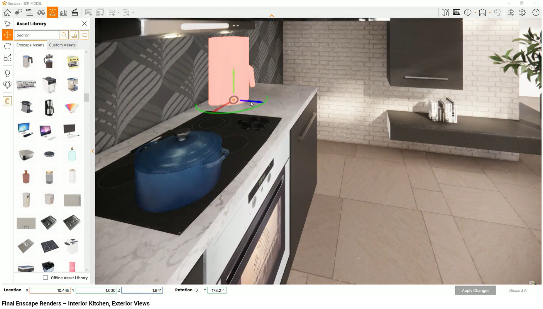
Without these elements, kitchens and living spaces feel oversized and abstract. With them, the same geometry becomes relatable and believable.
Empty renders often suffer from visual flatness because everything exists on a single layer.
Layering introduces depth:
rugs anchor furniture groups and break large floor surfaces
curtains soften window openings
wall decor interrupts large vertical planes
This layering reduces the “catalog” look and adds visual rhythm, making spaces feel composed rather than empty.
Perfect alignment is unnatural.
When objects are placed with mathematical precision—frames perfectly centered, plants evenly spaced—the result feels artificial. Real interiors contain small imperfections.
Introducing slight rotations, offsets, or density variation creates organic irregularity. This subtle randomness prevents the “soldier row” effect that immediately signals a digital model.
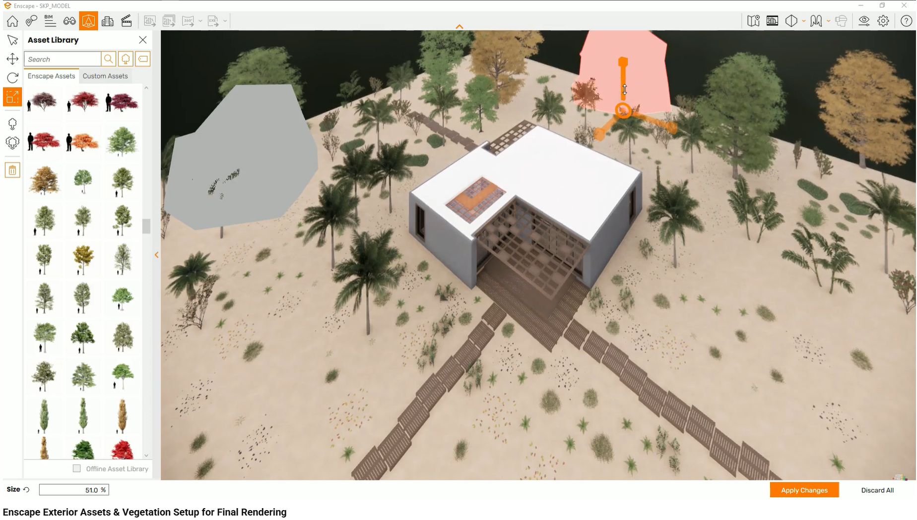
An interior does not exist in isolation.
When windows reveal an empty plane or a flat horizon, the entire scene feels disconnected from reality. Even if the interior is well styled, the exterior void breaks immersion.
Adding vegetation, terrain variation, and environmental context grounds the building in a believable setting. This frames the interior and reinforces the sense that the space exists in the real world.
Once environmental styling is added, clients stop evaluating the render as an object and start responding to it as a place.
They comment on mood, comfort, and lifestyle instead of emptiness or scale. Questions shift from “why does this feel strange?” to “can we change this accessory?” or “what if we add something here?”
This is a critical transition—from doubt to engagement.
What goes wrong:
Kitchen surfaces are left completely bare.
Why it happens:
The workflow stops after placing cabinets and appliances.
How it affects client perception:
The kitchen feels uninhabited and difficult to scale mentally.
What goes wrong:
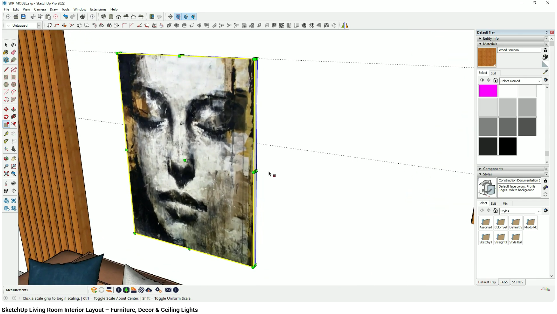
Rugs, pictures, or decor do not sit flush with floors or walls.
Why it happens:
Items are placed without checking alignment on all axes.
How it affects client perception:
The illusion of weight and gravity breaks, reducing realism.
What goes wrong:
Exterior views show empty planes or minimal context.
Why it happens:
Exterior styling is treated as optional or out of scope.
How it affects client perception:
The building feels like a model floating in space.
These issues compound, reinforcing the sense that the render is incomplete rather than intentional.
This topic is covered in the interior design visualization course as part of broader workflows related to staging, environmental assets, and final presentation polish.
This article focuses on environmental styling and context in interior renders. Topics such as material realism, lighting presets, and detailed joinery modeling are covered separately.
Why construction-level joinery detail in 3D models increases client trust and confidence in interior design projects.
How interior designers make materials look realistic in 3D by controlling scale, orientation, depth, and surface behavior.
Learn which visualization mistakes confuse interior design clients and how poor realism, lighting, and context affect approval.